Saturday, November 21, 2015

Post-Modernism.

Contemporary Design started in the 1960s and is still a relevant design style today. Contemporary Style is personally one of my favorite design styles.

Robert Venturi:
His design aspects embraced the ornamentation within the design as well as the inclusion of historical design. Venturi designed the Vanna Venturi House in Philadelphia and his most famous piece of furniture is the Chippendale Chair.


Richard Meier:

Richard Meier designed the Getty Center in Los Angeles, California. This structure consisted of a lot of geometric shapes and is white in color.


Richard Meier also designed the Douglas House in Michigan. I personally, really enjoy this house, and just like the Getty Center, this building also used geometric shapes and was white in color. I especially enjoy how this house is built on the side of a hill that is covered with trees.


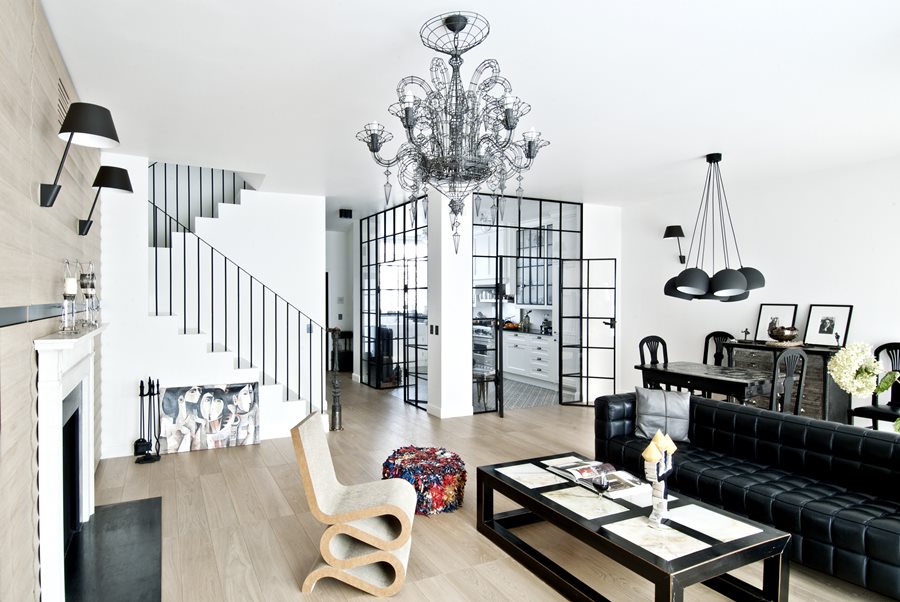
Modern Examples:


Peer Review: Countries.

I enjoyed how Miryam titled her blog post as "Bucket List"; all of the structures she posted were definitely bucket list worthy. It was really interesting seeing all of the structures from different countries and it's cool to see everyone's favorites.

I especially liked how Emma did her blog on Dubai since that was the one my group presented on. Dubai has a ton of beautiful structures. I like how she posted about the Palm Islands as it was also a favorite of mine.

Denmark Presentation.

The Denmark presentation had some interesting architectural buildings. I really enjoyed the Blue Planet Aquarium; it holds seven million liters of water and all 20,000 animals have been transferred from all around the world. It opened in 1939 and it is the largest aquarium in northern Europe.


The 8 Tallet was also an interesting building from Denmark. This building is a housing complex in Copenhagen and it was built with the thought of community and family in mind. This structure is in somewhat of a figure eight shape. The structures roof also slopes down to the ground for parking and this location also provides a garden and park area for the people who live in the complex.


Saturday, November 7, 2015

Mid-Century Modernism.

Mid-Century Modernism design took place between the 1950s and 1960s. The architectural design elements for this movement included flat roofs, asymmetrical profiles, expansive glass window walls, clean lines, open floor plans, and worked towards combining the outside and inside spaces. This was the first design movement to use bi-level structures and it was most popular on the western coast. As they tried to incorporate the outdoors with the indoors, it is no wonder that the color scheme for this design involved a majority of warm, earthy tones (olive green, burnt umber, pumpkin, and mustard yellow). A lot of malleable material was used in the creation of the furniture to make interesting designs.


Eero Saarinen

Architect of the Industrial design who also designed a lot of furniture. The Tulip Chair (Above) was one of his, along with the Tulip Table, the Womb Chair, and Executive Chair.


Charles and Ray Eams

A design couple: Charles was an architect and industrial designer, Ray was an artist and film maker. They designed a large amount of furniture together.

Lounge Chair


Sofa


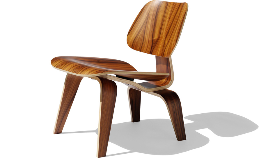
Molded Plywood Chair


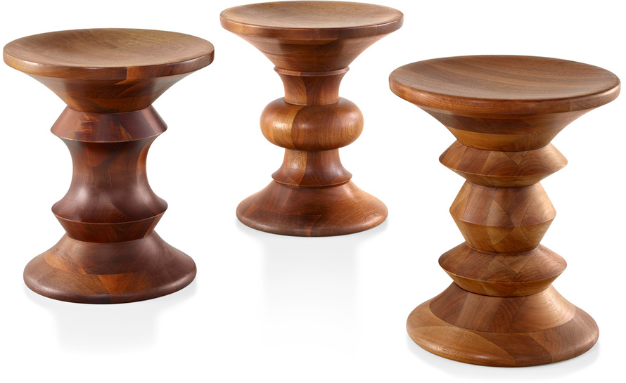
Walnut Stools


Modern Day:


Sunday, November 1, 2015

Peer Reviews: Herman Miller

Amanda M did a really nice job touching on the majority of the topics that our guest speaker discussed in his presentation. I really liked that she added the photograph of some textiles to her blog post.

I liked how Katie talked about the 'action office' in her blog and talked about how it was a more ergonomic conscious atmosphere and how Herman Miller set the stage for that.


Saturday, October 31, 2015

Herman Miller.

We had a speaker from the Herman Miller Furniture store come in to our class and give us a brief history on the company. The company is based in Zeeland, Michigan and was founded in 1905. The original name of the company was Michigan Star Furniture Co.; however, the company decided to sell their business and a man named De Pree who worked for Michigan Star Furniture Co. for several years asked his father-in-law to give him the money to purchase the company. Once De Pree aquired the business he named it after his father-in-law, Herman Miller.

The Herman Miller company designs modern furniture for offices as well as residential homes. Some of their most famous furniture includes the aeron chair, equa chair, noguchi table, the marshmallow sofa, and the Eames lounge chair.

Aeron Chair


Marshmallow Chair


Eames Lounge Chair


Herman Miller also strives to be as sustainable as possible. An example of this is when one of their facilities had an issue with paper wasps attacking their employees whenever they went outside, the company could have called an exterminator to spray down the whole place, but instead they hired a bee keeper and brought in honey bees to fend off the paper wasps; this is a "natural" way to get rid of the wasps rather than using poisons. The honey bees are also shipped to warmer climates in the winter time so that they can enjoy warmer climates while it is cold in Michigan over the winter season and brought back when the weather warms up.

Sunday, October 4, 2015

Peer Reviews: Modernism.

Emma: I thought she did a good job of touching on each of the main architects of the modernism movement. I also really liked Emma's second choice for her modern day example of Modernism.

Happy: I love how happy made a lot of detailed lists, it made the material easy to understand and helped keep the blog post on point. Also, the imperial hotel in Japan looks really cool!

Saturday, October 3, 2015

Modernism.

Modernism emerged between the 1900s- 1950s with Art Nouveau and and Prarie Style being the main inspiration and contributors to the new modernism design. There were a lot of new technological contributions during this time period; skyscrapers, cars, trains, photography, and moving pictures. This new, forward thinking design was very much anti-historical and became pro-industrial, with functionality being one of their main concerns.

International Style: International Style was a design form during the 1920s and 1930s and the main points you can take from 'International Style' includes "the expression of volume rather than mass, the emphasis on balance rather than preconceived symmetry, and the expulsion of applied ornament".
                Characteristics of International Style: 

      • simplification of form
      • rejection of ornamentation
      • glass, steel, and concrete as preferred materials
      • transparency of buildings
      • acceptance of industrialized mass productions

               International Style Architects:
      • Frank Lloyd Wright- American
      • Walter Gropius- German; Style: Unornamented, functional, and industrial feel
      • Ludwig Mies Van Der Rohe- German; Design features: Onyx marble screen, Structural elements had a mirror polished steel
      • Le Corbusier- France; most know for urban design

Modern Day Examples:


Saturday, September 26, 2015

Frank Lloyd Wright.

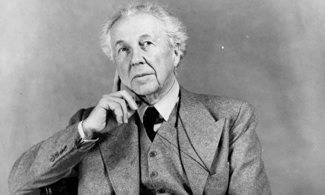
Frank Lloyd Wright was born in Wisconsin in 1867 and became an educator, writer, and architect who designed and completed over 500 structures. He began his architectural work with Louis Sullivan, however, they did not enjoy working together, which caused Wright to branch out on his own and start up his own architectural firm.


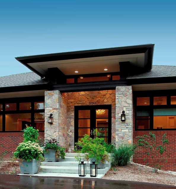
Wright was very much influenced by the Arts and Crafts Movement, which makes sense since it was a popular moment during this time. Eventually, Wright matured in his designs and formed the Prairie Style which he is most famous for today. Some aspects of the Prairie style were long, low to the ground structures, shallow, sloping roofs, overhangs and a lot of unfinished materials.


Wright would also design some of the interiors inside the homes, such as lighting, furniture, and stained glass, that fit along with his own architectural designs.


Modern Day Examples:


Friday, September 18, 2015

Peer Reviews: Protomodernism.

Rachael: She did a really nice job of giving a detailed background of the design period. I also really liked the interior she chose for her modern day example.

Angie: I appreciated how she touched on several different aspects of the protomodernism design, since there are a lot of different movements within it.

Protomodernism.

Protomodernism was the beginning of the Modernism and it involved a lot of experimentation with forms and ideas. A concern for Protomodernism was making sure that they had high quality products that they could also mass produce. The Victorian era had a lot of mass production however the quality of their design was quite poor. The Arts and Crafts movement involved a lot of high quality work, however there was no mass production due to the individual craftsmanship. The Protomodernism tried to combine the best qualities of post design periods so that the population could enjoy good quality design.

Josef Hoffman: Was an architect and designer for 50 years who specialized in textiles, furniture, metal and glass work.
Morris Chair-


Kubus Chair-


Palais Stoclet-


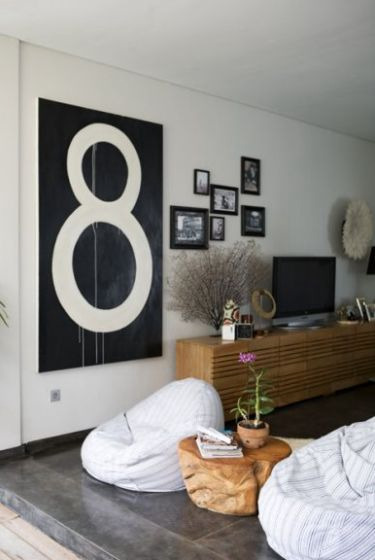
Modern Day Examples:


Sunday, September 6, 2015

Peer Reviews: Art Nouveau.

Alecia: I liked how she focused on one of the major influential people of the movement and gave some history background.

Allysia: I think she did a really good job of giving the characteristics of this movement; she gave a very good description and I feel very informed on the design style.

Saturday, September 5, 2015

Art Nouveau.

Art Nouveau is personally, my favorite design style; I love the swirls and creative style of this design. Art Nouveau began around 1900 and this design style was very much inspired by nature, being organic, and William Morris.


Some characteristics of Art Nouveau were the rejection of the Victorian style, use of iron and glass, electric lighting, paintings and sculptures, and the nature inspired designs.

Belgium and France lead the Art Nouveau movement.

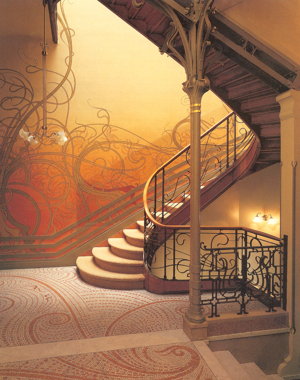
Victor Horta: Belgian architect and designer who was very involved with this moment and a very influential designer. Some of Horta's key elements were iron railings, mosaic tile on the floors, and stenciled walls and ceilings.


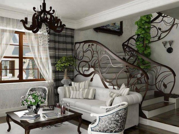
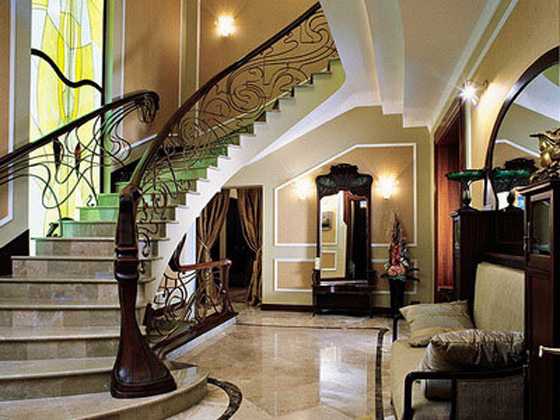
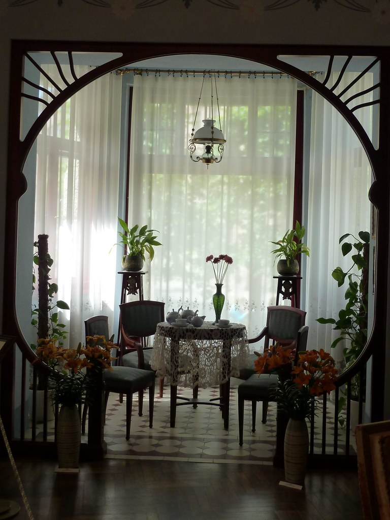
Modern Day Examples:


Saturday, August 29, 2015

Arts and Crafts.

The Arts and Crafts movement began in the late 1800s and it was a reaction to the Victorian era and the industrial movement. The Arts and Crafts movement valued sturdy, craftsman work; this means that a key factor of the movement was no industrial made furnishings, all furniture was hand made and focused on stability and durability. 

William Morris: A key person in the development of the Arts and Crafts movement; he believed that people should remove the excess and focus more on the solid necessities rather than lavish nonsense materials. 


Wood was used in a lot of the Arts and Crafts design. It sort of went back to medieval design, using solid structures and exposed hinges. They wanted to be able to see that the furniture was hand crafted and not made in a factory. 


Any elaborate detail in the Arts and Crafts design was always handcrafted.


Modern Examples: